
Podcastdata.org: Explore Podcasting 2.0 by the numbers
Podcastdata is an opendata service allowing to visualize statistics about the podcasting ecosystem.
In our rapidly evolving digital age, one thing is clear: data is king. In every industry and field of study, comprehensive and accessible data has the potential to reveal valuable insights, drive decisions, and chart new territories. Today, we're excited to introduce PodcastData.org, a new platform developed by Ad Aures that caters to the podcasting world by providing open, free-to-use data.
The Power of Collaboration: PodcastIndex
This initiative would not have been possible without the collaboration with PodcastIndex, a pioneering open-data platform for podcasting and the driving force behind “Podcasting 2.0”. For four years, PodcastIndex has been the beating heart of the podcasting ecosystem, tirelessly collating and providing valuable information.
Developed by Adam Curry, affectionately known as "The Podfather" for his pioneering involvement in the podcasting space since its inception, and Dave Jones, the diligent maintainer of the PodcastIndex website, PodcastIndex has become an invaluable resource. Today, it hosts data on over 4 million podcasts, all of which can be accessed and downloaded with a single click from its homepage.
Visualizing Data Beautifully: RawGraphs.io
But providing raw data is just one part of the equation. We also wanted to ensure that users could easily understand and interpret this data. To this end, PodcastData.org leverages an open-source tool, rawgraphs.io, to allow users to create stunning visual representations of the data.
With just a few clicks, you can transform numerical datasets into engaging graphs that illustrate trends, relationships, and patterns. From pie charts to scatter plots, line graphs to bar charts, you'll be able to visualize the data in a way that best suits your needs.
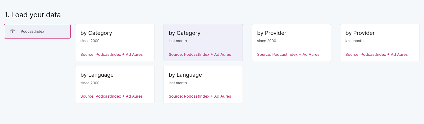
Let's say we want a graph about the average episode duration by podcast category. How to build this graph?
First choose a source file, let's say “podcast by category”, for the last month.
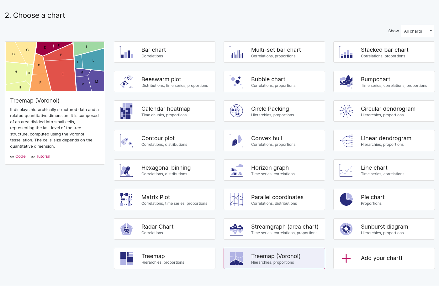
When the data is loaded, choose a Voronoi diagram (this is very synthetic and clear to show proportions).
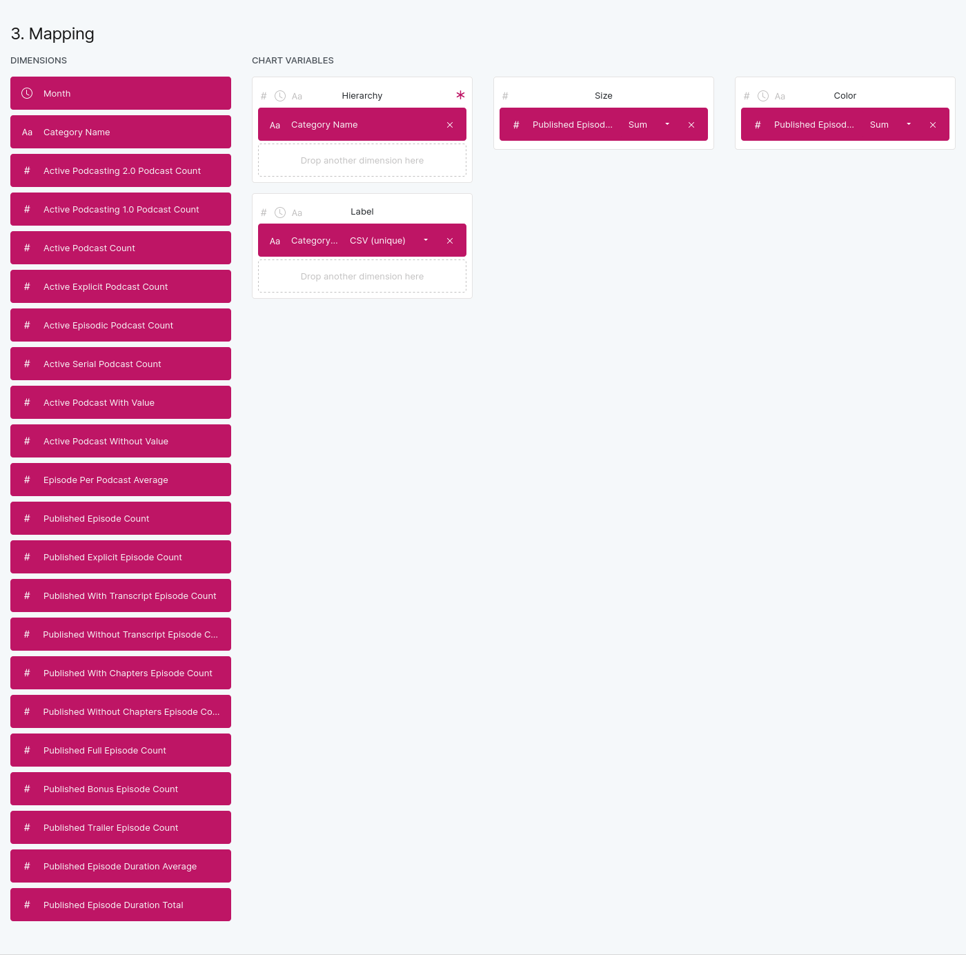
Choose your mapping (which data will be used and how it will be used). Put the Category Name column in the hierarchy variable (this variable is the slicing of the diagram) as well as in label (the name of cells), then put Published Episode Duration Average in the size variable (the size of the cells) as well as in color (the color of the cell will depend on the value).
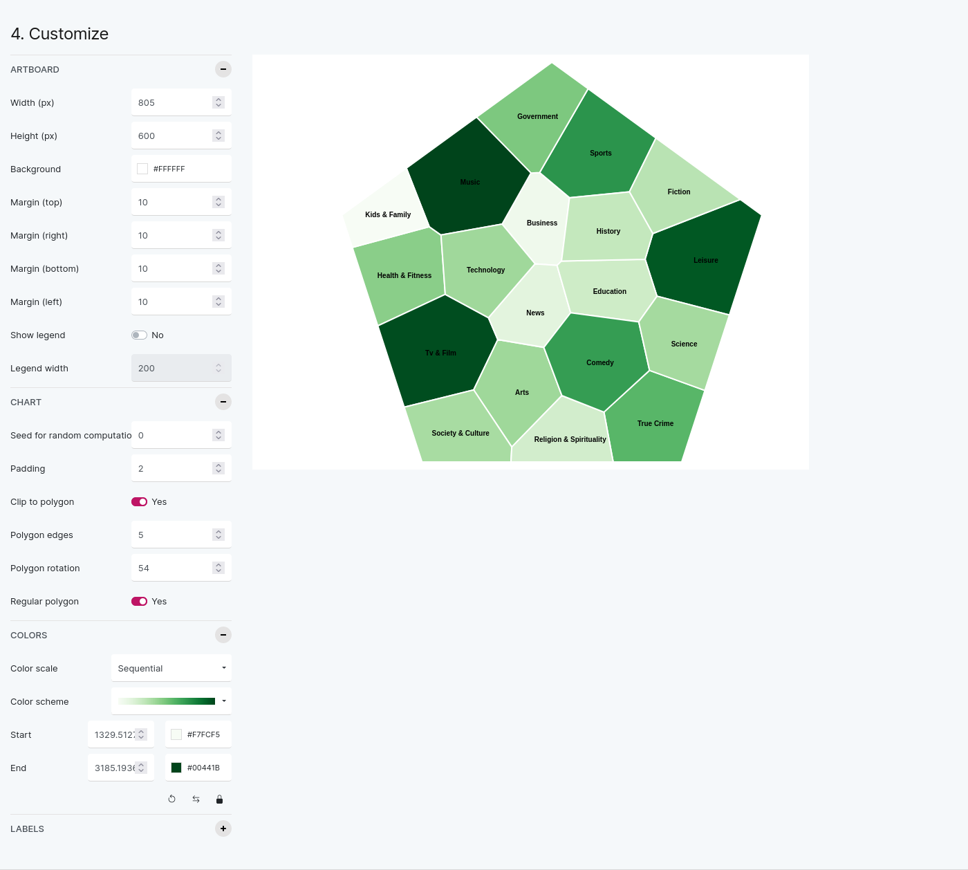
Configure the chart (the color scale, the number of edges and the rotation) to get a beautiful graph.
Finally export the graph to publish it everywhere you want to.
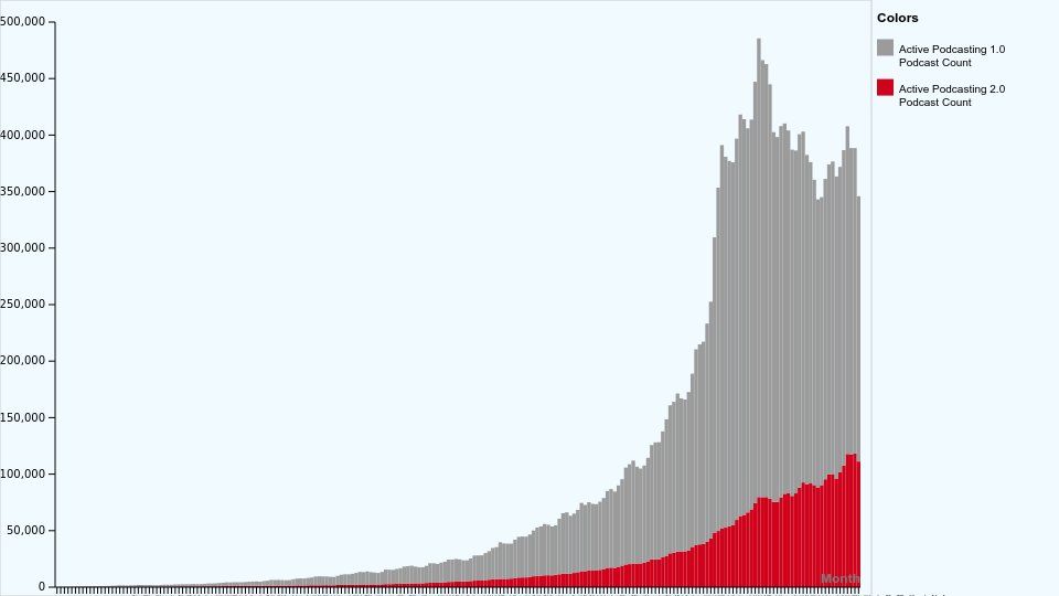
Using any source from 2000 you can build a stacked bar chart showing the evolution of podcasts with podcasting 2.0 tags through time (month on x axis, active Podcasting 2.0 podcasts and active podcasting 1.0 podcasts on size, you can adjust colors and show labels in the chart parameters).
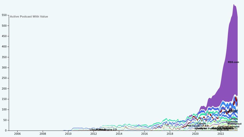
You can build more complex graphs:
Staying Up to Date: Monthly Updates
To ensure our users always have the most current information at their fingertips, PodcastData.org is updated monthly. As the podcasting world continues to evolve and expand, so too will our datasets.
Whether you're a podcast creator, advertiser, researcher, or fan, PodcastData.org has something to offer you. Dive into the wealth of data now and start uncovering the insights that matter most to you.
If you want to stay updated, follow the podcastdata project on Twitter: @podcastdata_org
And feel free to mention @podcastdata_org and #podcastdata so that we can share the graphs you made!


